 | |||
 | |||
 | |||
 | |||

Here's something else
to think about. When you're gathering up the artwork that the client has given
you and you are sitting down to create the layout, you really need to have
an idea of how that artwork will fit into the ad.
As we discussed in the layout portion, to indicate art, simply draw the outline
of the shape of the original artwork in the dimensions you would like it to
appear. Inside the shape, write "art 1" to label the shape, making
it as easy as possible to read. Remember that you need to keep in mind how
the artwork will look when it's either enlarged or reduced to fit in ad, so
you need to make sure that your original artwork will scale proportionally
to fit in the space you've designated. Here's what you need to know:
Proportional
scaling
Proportional scaling is when both the width and the depth of the artwork
are reduced or enlarged by the same percentage. This is usually easily done
by the artists on their computer systems although some use a copy machine
with reduction capabilities.

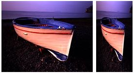
Anamorphic scaling is when the width and depth of the artwork is scaled by different percentages. For example, you may think it's a good idea to make the image long and narrow down one side of the ad, however, if the image you're working with is not long and narrow to begin with, then this could severely distort the image. Imagine a standard 3x5 or 4x6 photo of your family or friends. Now imagine trying to squeeze that image to fit into a space 1 inch wide by 10 inches deep. The figures in the photo would stretch so much that they would be unrecognizable to you. The same theory applies to photos of the advertisers products.
So when you're sketching out your layout for an ad, keep these things in mind and be sure that the space you've indicated for the artwork will accommodate it as well.
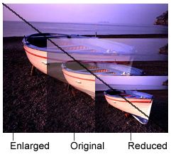
Here's an easy way to see what dimensions your artwork would naturally fit into. See the scaling diagrams on the right. First make a copy of the original artwork and set the original aside in a safe place. Using the copy only, draw a line from one corner to the corner diagonally across from it. Then by drawing a horizontal line and a vertical line from any one point on the diagonal line, you will see a box that the artwork could be scaled to fit into proportionally. You can then use this sheet as a guide for drawing the area on your layout sheet and the artists will be able to see exactly where and how big you would like the artwork to appear.
|
Determining how your artwork will scale proportionately: Illustrated at right is an easy way to see how your artwork will scale. 1. Make a copy of your original artwork. Set the original aside. 2. Using the copy only, draw a line between the two diagonal corners. 3. Draw a horizontal and vertical line from any one point on the diagonal and you'll have a scaled version of the original. |
 |